2018
Japan Tourism Identity Concept
A brand identity concept for Japan tourism
{brand identity, visual systems, motion design, print and digital applications}
Overview
An identity concept
This identity concept was developed as an undergraduate project at The Ohio State University. I reimagined the Japan National Tourism Organization’s visual system around three qualities: cultural, welcoming, and powerful. The project received a Creative Best Award of Merit from the Columbus Society of Communicating Arts in 2019.


Identity System
Building a flexible visual language
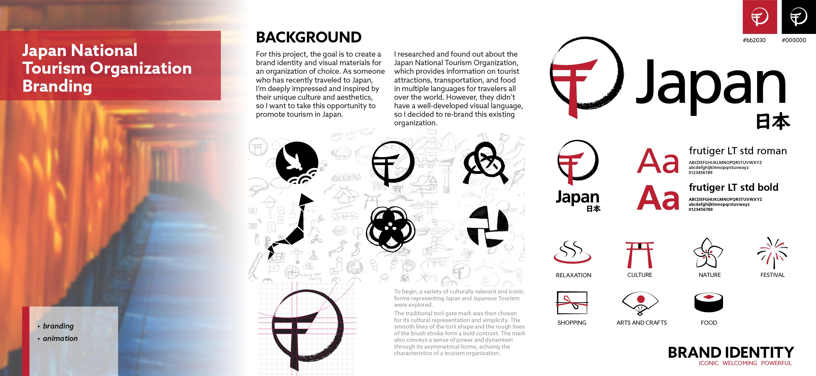
The identity combines a simplified torii form with an expressive brushstroke circle. A red, black, and white palette, modular typography, and a family of cultural icons create a consistent system that can adapt across formats while remaining recognizable.
Applications
Extending the identity across visitor touchpoints
The brand identity system was applied to stationery, postcards, digital interfaces, airport signage, promotional products, packaging, and aircraft livery. Repeating icons form a secondary pattern, while photography and bold color blocks help the identity scale from small printed pieces to large environmental applications.